

Categories Gadget v2.0
UX & User Interface Design
Interactive exercises are the core of the Versal platform and one of our most widely used gadgets was in dire need of a UX overhaul. Before I breakdown the problems and solutions, it's important to understand the original concept for the gadget: allow authors to create a timed, interactive matching exercise for their learners.

The Backstory
'Categories' is probably one of our most used gadgets, and was also one of our most frustrating gadgets (as identified by unhappy users). We frequently received requests for new features to be added to Categories as well as "how-to" questions to our support center. People could see the potential of a timed matching exercise, but the reality of the user interface did not meet that potential. Below are some snapshots of the gadget as it looked before the redesign.
Authoring View - Before the Redesign

Learner View - Before the Redesign
The Problems
A crowded interface restricted by 'WYSIWYG' design principles - meaning the Author should see exactly what the Learner will see. A respectable concept in theory, but in reality it actually creates a frustrating experience for both parties.
- 'Add a card' button falls off screen after 3 cards, forcing the Author to horizontally scroll to retrieve it
- Authors cannot add instructions for the Learner
- Timer is small and unnoticeable
- Images are not supported
The Learner view generally had an uninviting interface. No guidance for the learner. How do they start the exercise? What is the exercise?
- Not optimized for mobile screens
- 'Start' button for Learners is really easy to miss
- Where is the timer?
- What does "0/4" mean?
Designing Version 2.0
The challenge with many of Versal's components is that there are always two user audiences - the Author and the Learner. Which one is more important? Do we compromise the UX for the Learner by forcing the design into a "What You See Is What You Get" system? Do we compromise the UX for the Author by giving the Learners a slick UI that doesn't at all match the way an Author inputs content?
The answer: No. We should not have to compromise one UX for the other. We should create a system that is flexible enough to bend (where appropriate) for one user type or the other.
Our solution is an analogous system: Authors and Learners see a very similar interface, and where appropriate, components change to reflect the unique perspectives and goals of each user. One example, Authors see a large (+) button in top left corner - representing their primary action: Add a card. For the Learner, that button becomes the 'Start' button - reflecting their primary action. The placement doesn't change, the styling doesn't change and in fact - the intent does not change. This is the primary action for both users.
v2.0 Authoring View - After the Redesign
Goals
- Increase clickable area for all buttons/actions
- Add image support (for both cards and categories)
- Allow Author to add customizable instructions for Learners
- Make the 'cards' actually look and feel like cards
- Add a level of visual interest that matches the interactivity of the gadget

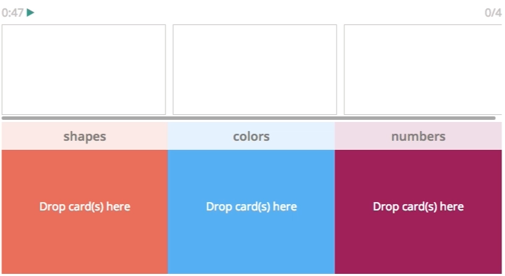
v2.0 Learner View - After the Redesign

Explainer Video
Any product update would be incomplete without the usual explainer video - so click play below if you feel like learning more about the gadget's new functionality. You'll see how to add images to categories, assign cards to multiple categories, and more.